Beyond Averages: How to Use Cross-Tabulation to Uncover What Your Survey Data is Really Saying
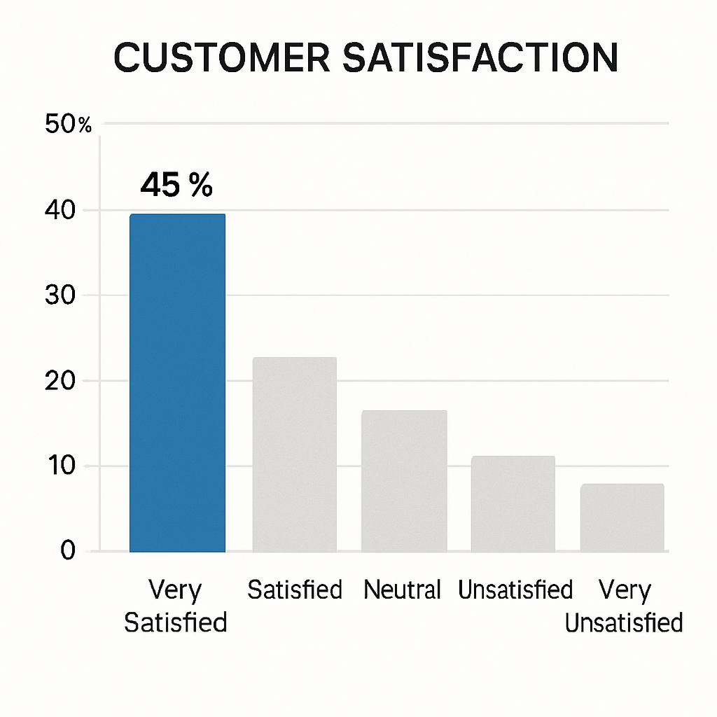
You just closed your latest customer feedback survey. You’ve got a Net Promoter Score (NPS), a Customer Satisfaction (CSAT) score, and a neat pile of percentages. 75% of users are "satisfied." Your NPS is +40. Great.
But what does that actually mean?
The truth is, top-line numbers are dangerously misleading. They give you a false sense of clarity while hiding the most critical insights. Your +40 NPS could be masking a huge problem: what if your most valuable, long-term customers are actually detractors, while new users on a free trial are the only ones who are promoters? Relying on the average is like trying to navigate a city with a map that only shows the borders.
You’re probably here because you’ve felt this frustration. You have the data, but you don't have the story. The good news is that there's a straightforward, powerful technique to get past these vanity metrics. It’s called cross-tabulation, and it’s the key to unlocking the actionable insights hiding in plain sight.
This guide will show you how to use cross-tabulation to transform your flat survey data into a multi-dimensional map of your customer base. No jargon, no complex stats—just a practical way to understand who is saying what, and why.
What You'll Learn:
- What Cross-Tabulation Actually Is (in Simple Terms)
- A Step-by-Step Guide to Doing It in Excel
- How to Interpret the Results to Find Actionable Insights
- Why This Technique is Essential for Meaningful Feedback
What is Cross-Tabulation? (And Why It's a Superpower)
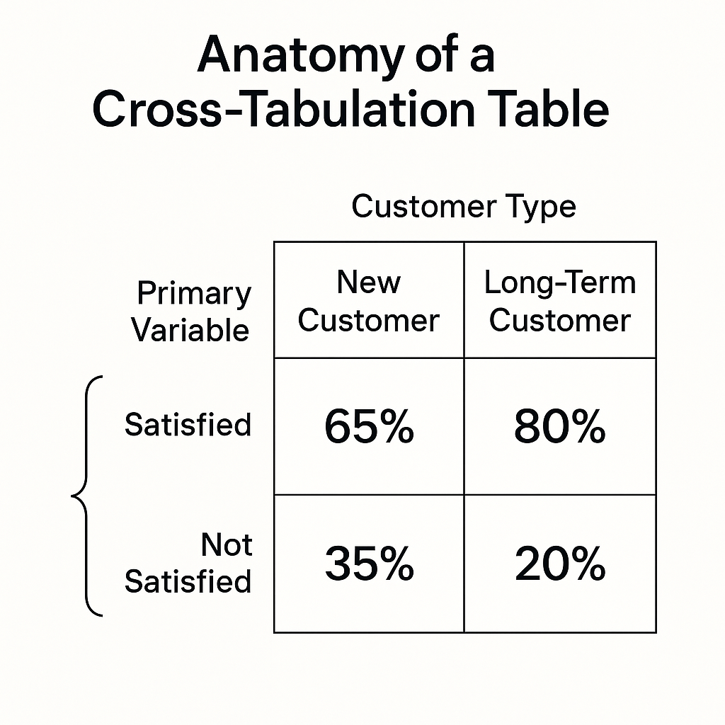
Cross-tabulation (or "crosstab") is just a fancy name for a simple concept: comparing the results of two different survey questions against each other in a table format.
Think of it like this: A simple frequency table tells you what people said. A crosstab table tells you who said what.
Instead of just looking at the overall percentage of people who gave you a 9/10 NPS score, you can break it down to see the NPS scores for specific groups. For example:
- New Customers vs. Long-Term Customers
- Users on the "Free" Plan vs. Users on the "Pro" Plan
- Customers in North America vs. Customers in Europe
This is where the magic happens. You move from a one-dimensional view ("What are our users saying?") to a two-dimensional view ("Which users are saying what?"). It’s the difference between a photograph and a CT scan.
I’ve seen this firsthand. A startup I was advising was thrilled with their 80% CSAT score. But they were struggling with churn. We ran a simple crosstab comparing CSAT scores against customer tenure. The insight was immediate and alarming: their most loyal customers of 2+ years had an average CSAT of just 55%, while brand new users were at 95%. The high average was completely masking the dissatisfaction of their core user base. That single insight changed their entire product roadmap for the next six months.
This is exactly why we built FormLink.ai—to move beyond sterile grids and get to the human story behind the data. Every hour you spend wrestling with spreadsheets is an hour you're not spending on your product.
How to Do Cross-Tabulation Analysis in Excel: A No-Nonsense Guide
You don't need a statistics degree to do this. If you have your survey results in a spreadsheet, you can create a crosstab in about five minutes using a PivotTable in Excel or Google Sheets.
Let's walk through a common scenario: You've just run an NPS survey and you want to see if your score differs between new and tenured customers.
Your Raw Data: Imagine you have a spreadsheet with at least two columns:
- Column A: NPS Score (The 0-10 rating each user gave)
- Column B: Customer Tenure (A category you've added, like "New" for <3 months or "Tenured" for >1 year)
Here’s how to do it, step-by-step.
Step 1: Select Your Data
Click anywhere inside your data set. Go to the Insert tab in Excel and click PivotTable. Excel will automatically select your data range. Just click OK.
Step 2: Configure the PivotTable Fields
A new sheet will open with the PivotTable builder. Now, you just need to tell Excel what to show.
- Drag "Customer Tenure" to the "Columns" area. This will create a column for "New" and a column for "Tenured."
- Drag "NPS Score" to the "Rows" area. This will create a row for each score from 0 to 10.
- Drag "NPS Score" AGAIN to the "Values" area. This is the crucial step. Excel will default to showing "Sum of NPS Score," which is wrong.
Step 3: Change "Sum" to "Count"
Click on "Sum of NPS Score" in the Values area. Select Value Field Settings. Change the calculation from "Sum" to Count. This will now show you the number of people in each group who gave each score.
Step 4: (Optional but Recommended) Show Values as a Percentage
Raw counts are good, but percentages are better for comparison. Click on the "Count of NPS Score" field again, go to Value Field Settings, and click on the Show Values As tab.
In the dropdown menu, select % of Column Total.
Now, your table will show you the percentage of respondents within each tenure group that gave a specific score. You can instantly see if, for example, a higher percentage of Tenured customers are giving you scores of 6 or below (Detractors).
That's it. You've just made a cross-tabulation table.
From Table to Insight: What to Look For
You have your table. Now what? The goal is to find significant differences between the groups. Don't get lost in the weeds. Look for the big patterns.
Here’s a simple framework for interpreting the results:
- Compare the Extremes: Look at the Detractors (scores 0-6) and Promoters (scores 9-10). Is there a big difference in the percentage of Detractors between your "New" and "Tenured" customers? If 30% of your tenured users are detractors vs. only 5% of new users, you have a serious problem. This is a classic "leaky bucket" scenario.
- Look for Mid-Point Bloat: Pay attention to the Passives (scores 7-8). A large group of passives in a key segment (like high-value customers) is a risk. They are not loyal and are susceptible to competitor offers. What could you do to move them from a 7 to a 9?
- Ask "Why?": The crosstab tells you "what," but your job is to ask "why." Why are tenured customers so unhappy? Perhaps your new-user onboarding is fantastic, but your product fails to deliver long-term value. Maybe a feature they relied on was recently deprecated. The data points you to the problem; your expertise helps you form a hypothesis.
This is the kind of deep analysis that separates companies that collect feedback from companies that act on it. It's a foundational step, just like ensuring you're asking the right questions in the first place by following survey design best practices.
The Smarter, Faster Way to Get Insights
Let's be honest. While PivotTables are powerful, they're also clunky. It's a reactive process that happens long after the survey is complete. Every hour spent exporting data, cleaning it, and wrestling with Excel is an hour you've lost.
This frustration is the very reason we built FormLink.ai. We believe that getting deep insights shouldn't be a separate, manual step. It should be built into the platform itself.
Our platform is designed around conversational data collection, which feels more like a natural chat than a sterile form. But the real power is in the AI-driven analytics. FormLink can automatically surface these kinds of comparative insights for you. Instead of you having to hunt for the pattern, the platform flags it for you: "Warning: NPS score from users with accounts older than one year is 35% lower than your average."
This is the difference between an old tool and an AI-native one. It's not about just building forms; it's about shortening the distance between a question and an actionable insight.
Your Data Has a Story to Tell
Stopping your analysis at the overall average is leaving 90% of the value on the table. It's a lazy metric that papers over the critical differences within your user base.
Cross-tabulation is your first and most powerful tool to fight back. It’s a simple technique that forces you to look at your users not as a monolith, but as distinct groups with unique needs and experiences. It helps you compare different feedback scores, whether it's CSAT vs. CES vs. NPS, and see the full picture.
So the next time you run a survey, don't just report the top-line number. Dig one layer deeper. Compare your two most important customer segments. I guarantee you'll find an insight that makes the five minutes of extra work worthwhile.
Ready to stop wrestling with spreadsheets and start getting automated insights? Start building smarter forms with FormLink.ai for free.
What's the most surprising insight you've ever uncovered by segmenting your survey data? Share your story in the comments below