Uncovering Hidden Insights: A No-Nonsense Guide to Cross-Tabulation Analysis
You ran a survey. The results are in. You have a bar chart that says 70% of users are "satisfied" with your product. That's... fine? It’s a number. But it’s a flat, lifeless number. It tells you what people think, but it doesn't tell you who thinks it, or why.
Are your newest customers as happy as your loyal advocates? Are users on the free plan as satisfied as the enterprise clients? Is your product resonating more with technical users or business stakeholders?
Most basic survey reports are like looking at a black-and-white photograph of a rainforest. You can see the shapes of the trees, but you miss the vibrant colors, the hidden animals, and the complex ecosystem holding it all together. You're missing the real story.
This is where cross-tabulation comes in. It’s the tool that turns that flat, black-and-white picture into a rich, 3D map of your user feedback. This guide will break down what cross-tabulation is, why it matters, and how you can use it to find the actionable insights that drive smarter decisions.
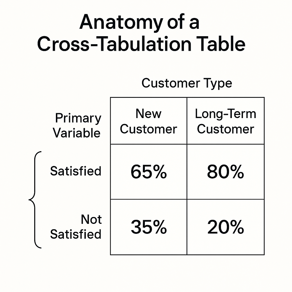
What is Cross-Tabulation, Really?
Let's ditch the textbook definition for a second.
Think of cross-tabulation (or "crosstabs," as they're often called) like a magnifying glass for your data. You have two different questions from your survey, and you want to see how they relate to each other. Cross-tabulation puts them into a simple table (also known as a contingency table) to reveal those relationships.
For example, you might cross-tabulate:
- Question 1: "How satisfied are you with our product?" (e.g., Very Satisfied, Satisfied, Neutral, Unsatisfied)
- Question 2: "How long have you been a customer?" (e.g., Less than 3 months, 3-12 months, More than 1 year)
The result isn't just a flat percentage of "satisfied" users. It's a detailed grid showing you the satisfaction levels for each customer tenure group. You might discover that your newest customers are overwhelmingly satisfied, but satisfaction drops off sharply after the one-year mark.
That’s not just data; it’s a directive. It’s a bright, flashing sign telling you to investigate why long-term customers are becoming less happy. That's the power of moving beyond averages.
Why You Can't Afford to Ignore Crosstabs
Relying on top-level survey results alone is a recipe for mediocrity. You're making decisions based on an incomplete picture. Here’s why cross-tabulation is essential for anyone serious about understanding their data:
- It Reveals Hidden Patterns: Crosstabs expose the relationships between variables. You can compare different segments of your audience to see how their opinions diverge. Are men and women experiencing your product differently? Do users in North America have different feature priorities than users in Europe?
- It Provides Actionable Insights: Knowing that 70% of users are satisfied is a vanity metric. Knowing that 90% of your new users are satisfied but only 50% of your long-term users are is an actionable insight. It gives you a specific problem to solve.
- It Adds Depth and Context: Cross-tabulation moves you from "what" to "who." It adds a layer of context that makes the data meaningful. It helps you build a more nuanced understanding of your audience by creating clear user segments.
- It Improves Your Decision-Making: By understanding the nuances in your data, you can make more targeted and effective decisions. Instead of a one-size-fits-all approach, you can tailor your product roadmap, marketing messages, or customer support strategies to specific user groups.
We didn't just build FormLink.ai because we were tired of clunky form builders. We built it because we were frustrated with getting shallow, unhelpful data from them. We believe that every hour spent trying to decipher a vague bar chart is an hour you're not spending improving your product.
How to Do Cross-Tabulation Analysis (Even in Excel)
You don't need a Ph.D. in statistics to do this. The most common tool for this job, if you're not using an integrated platform, is a spreadsheet program like Excel or Google Sheets. The magic happens with a feature called a PivotTable.
Let's walk through it. Imagine you have survey data in a spreadsheet. Each row is a single response, and each column is a question.
Your Raw Data Might Look Like This:
Here’s how to do cross tabulation analysis in excel using a PivotTable:
- Select Your Data: Click anywhere inside your data set. Go to the
Inserttab and clickPivotTable. Excel will usually auto-select your data range correctly. - Set Up the PivotTable: A new sheet and a "PivotTable Fields" pane will appear. This is your control panel.

3. Analyze the Output:
You'll instantly get a table that looks something like this:
4. Make it More Readable (The Final Step):
Raw numbers are good, but percentages are better.
- Right-click anywhere in the values section of your pivot table.
- Go to
Show Values As->% of Row Total.
Now your table will transform into this:
Boom. There it is. The insight is now impossible to ignore. While 77.5% of your new customers are happy, that number plummets to 42.5% for long-term customers. You have a retention problem, and now you know exactly where to start digging.
A Real-World Example: The Feature Request
Let's make this even more concrete. Imagine you're a Product Manager for a project management tool. You survey your users about a potential new feature: "Advanced Reporting Dashboard."
A basic analysis shows that 60% of users want the feature. Should you build it? Maybe. But let's cross-tabulate that request with the user's role.
The cross-tabulation reveals a crucial pattern:
- Project Managers: 95% have high interest.
- Team Members: 20% have high interest.
- Executives: 50% have high interest.
The 60% average was misleading! The feature is critical for Project Managers, but it's mostly noise for individual Team Members. This insight allows you to make a much smarter decision. You can build the feature but market it specifically to PMs, or perhaps design a "lite" version for other roles. You've avoided wasting resources building a feature for users who never wanted it in the first place.
A Quick Note on Statistical Significance
One final, important point. When you see a difference between two groups, you might wonder: "Is this difference real, or is it just a random fluke in my sample?"
This is where a statistical test called the Chi-Squared Test comes in. We won't go into the complex formulas here, but the concept is simple. The Chi-Squared test analyzes your crosstab table and tells you the probability (the p-value) that the observed difference happened by pure chance.
A general rule of thumb is if the p-value is less than 0.05 (p < 0.05), the result is considered "statistically significant." This means there's less than a 5% chance that the pattern you're seeing is a random accident. It gives you confidence that the relationship you've uncovered is real.
The Future is Automated, Conversational Insight
Fighting with PivotTables and manually running statistical tests can be time-consuming. It's a process filled with friction, which is exactly what we hate. Every minute you spend exporting CSVs and wrestling with Excel formulas is a minute you're not acting on the insights.
This is precisely why we built FormLink.ai with analysis at its core. Instead of forcing you to do this work manually, our platform is designed to surface these insights automatically. Because our forms are conversational, we don't just collect answers; we understand the context. Our AI can automatically identify significant patterns and highlight key differences between user segments in your analytics dashboard.
It’s like having a data analyst built-in, turning a complex, multi-step process into a single click. It's the difference between digging for gold with a shovel and having a machine that surfaces the nuggets for you.
From Flat Data to Actionable Strategy
Stop looking at the surface of your data. The averages, the top-line percentages—they are the beginning of the story, not the end. The real, actionable insights are hiding just one layer deeper, in the relationships and patterns that only cross-tabulation can reveal.
By comparing how different groups respond, you move from generic feedback to a specific, targeted plan of action. You stop guessing and start knowing. You can finally answer not just what your users think, but who thinks it, and that changes everything.
What's the most surprising insight you've ever uncovered by segmenting your survey data? Share your story in the comments below